Nourished Routes
Branding
ROLE
Brand Designer
SCOPE
Brand identity, visual system, logo design, and brand guidelines
OVERVIEW
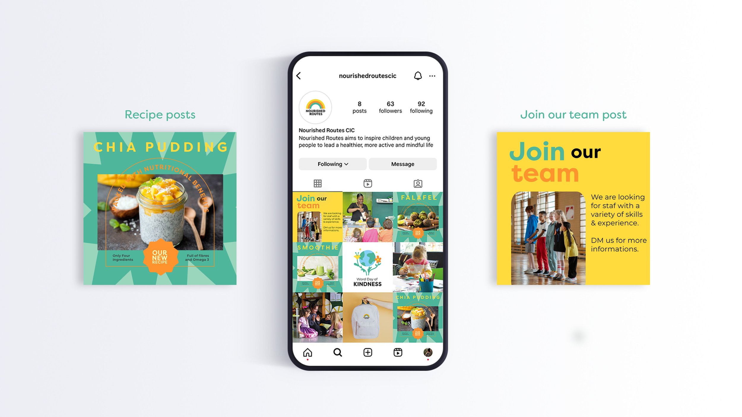
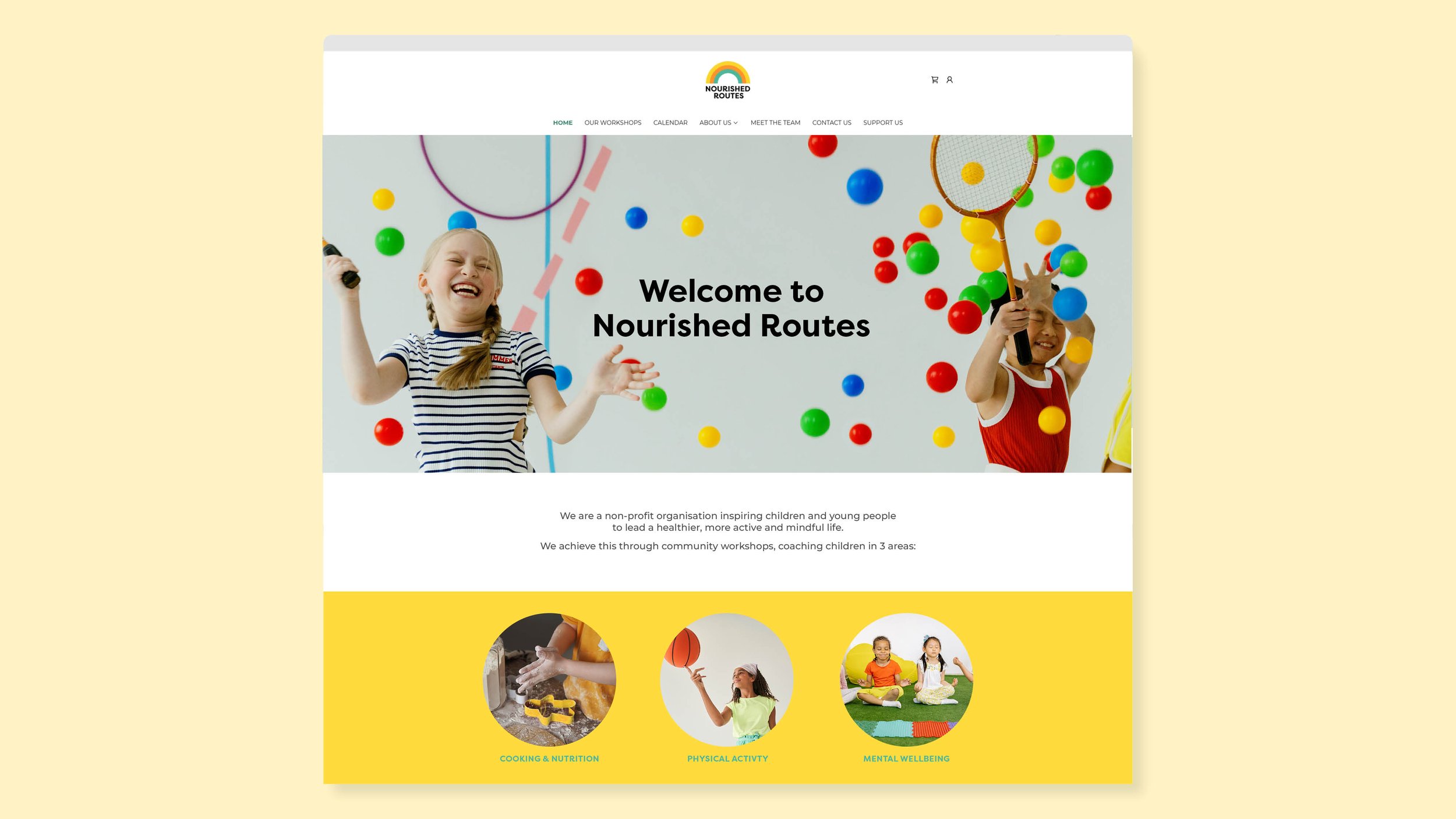
Nourished Routes is a Community Interest Company focused on supporting children’s wellbeing through healthier, more active, and more mindful lifestyles. The organisation approached me to create a joyful, vibrant, and caring brand identity that would feel approachable to both children and families, while clearly communicating their positive mission.
The identity centres around a rainbow symbol, representing hope, optimism, and inclusivity. Each colour reflects one of the organisation’s three core areas of expertise, creating a simple but meaningful visual language that captures their commitment to helping young people build brighter futures. The overall system was designed to feel playful and uplifting, while remaining clear, flexible, and easy to apply across community initiatives and communications.


Impact
Created a warm and distinctive visual identity aligned with the organisation’s values
Helped establish a stronger and more recognisable presence across community touchpoints
Developed a flexible brand system to support online and print presence
Designed an identity that resonated with both children and parents through positivity and accessibility