Manna
Branding
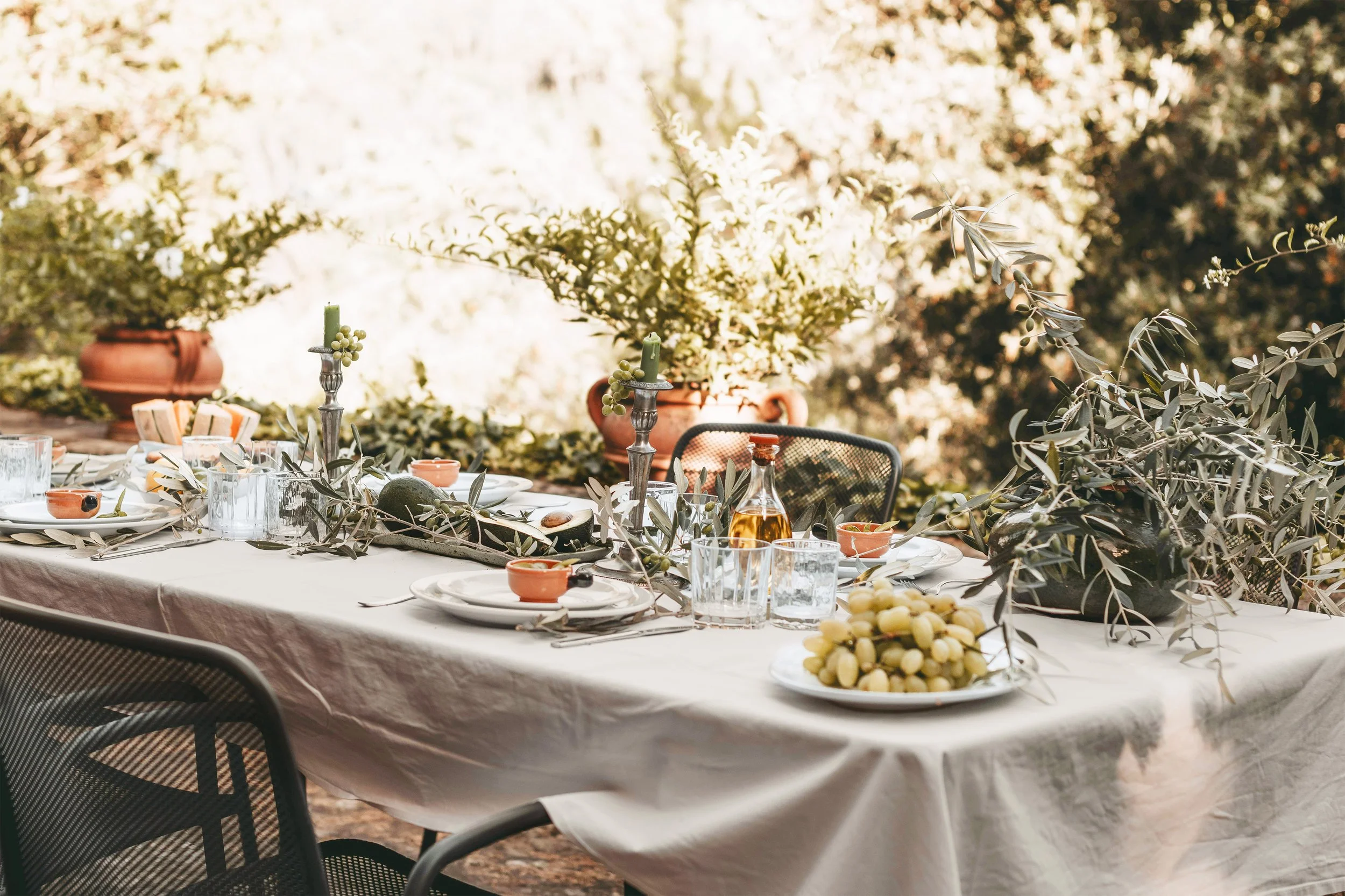
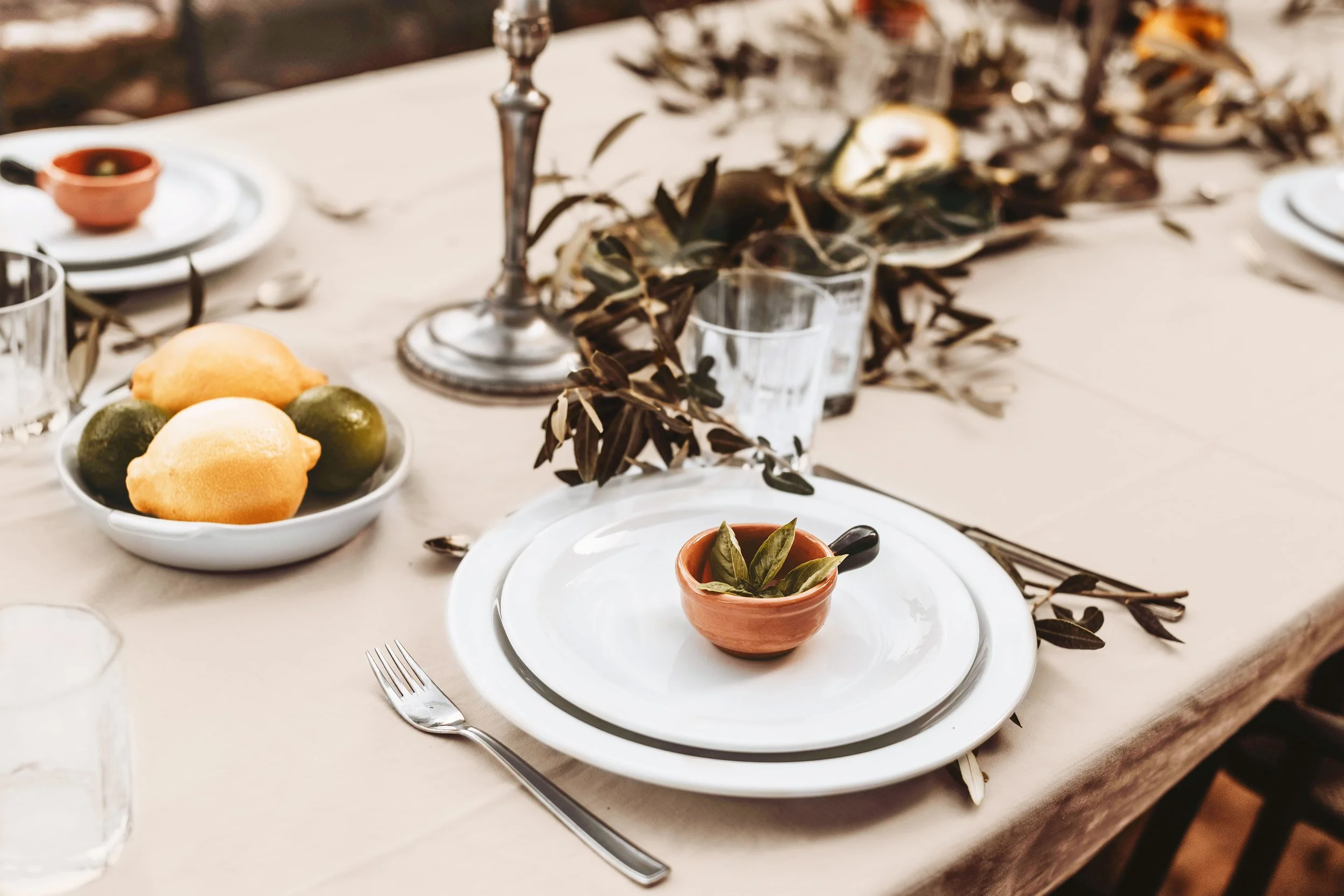
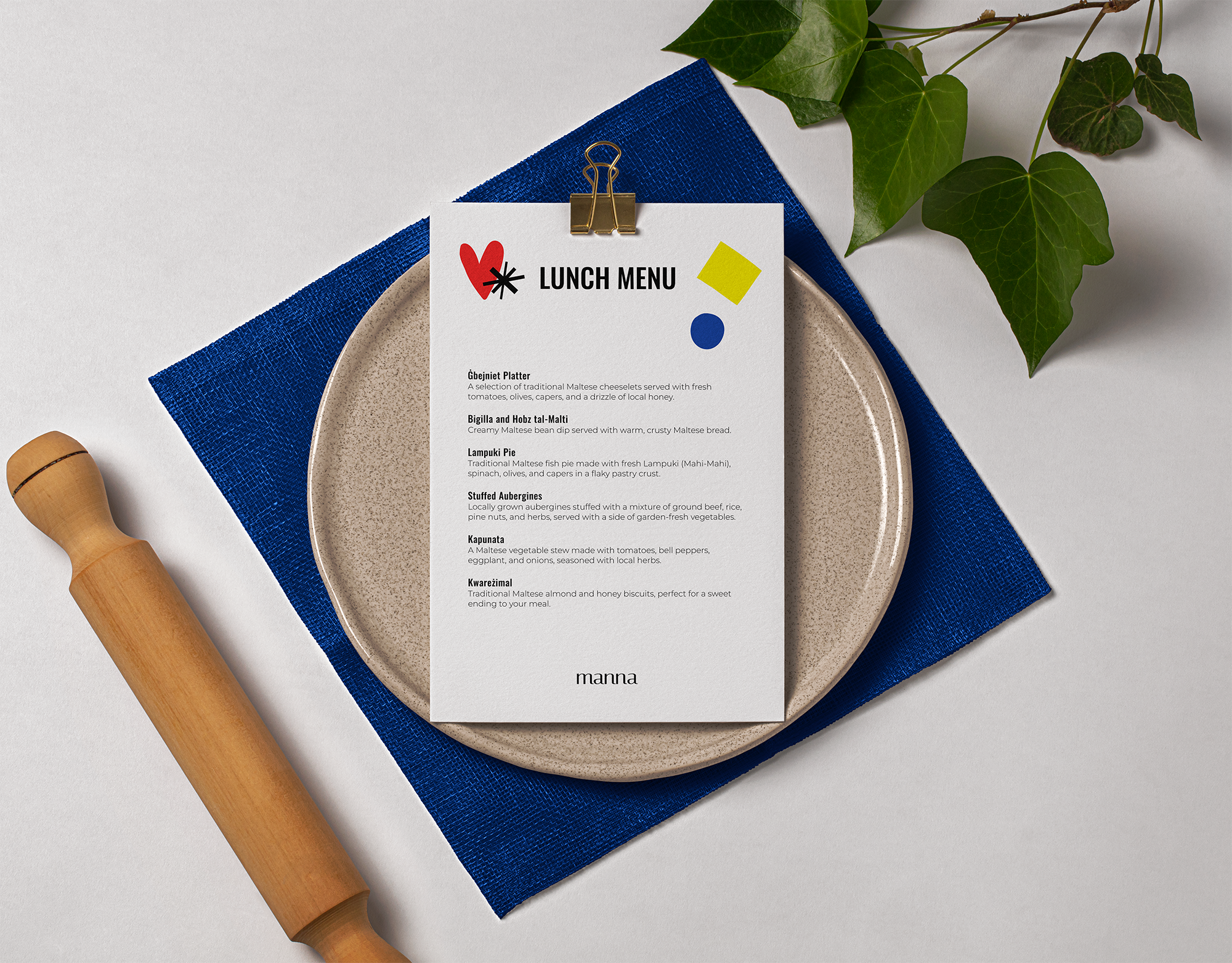
Manna is a luxurious olive farm nestled in the heart of Malta, offering a range of facilities including a farm shop, spa, dog hotel, and yoga retreats. The entire concept of Manna revolves around respecting the land, embracing local culture, and utilising the incredible natural resources available. Their mission is to make the world a better place by honoring and celebrating the best of local ecology, heritage, and culture.
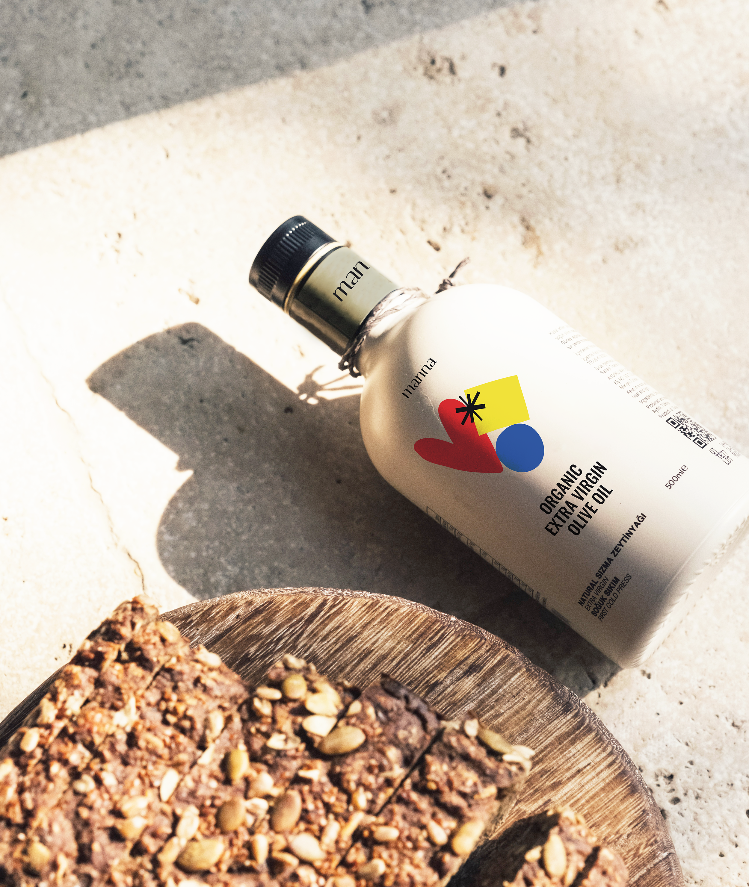
Building on a comprehensive brand strategy, I crafted a visual identity that translates Manna’s core values of love, honesty and kindness into a refined and cohesive design system.
This identity also reflects their mission to drive a bold and strong movement towards a better future.
With love, honesty and kindness,
we believe we can do anything.
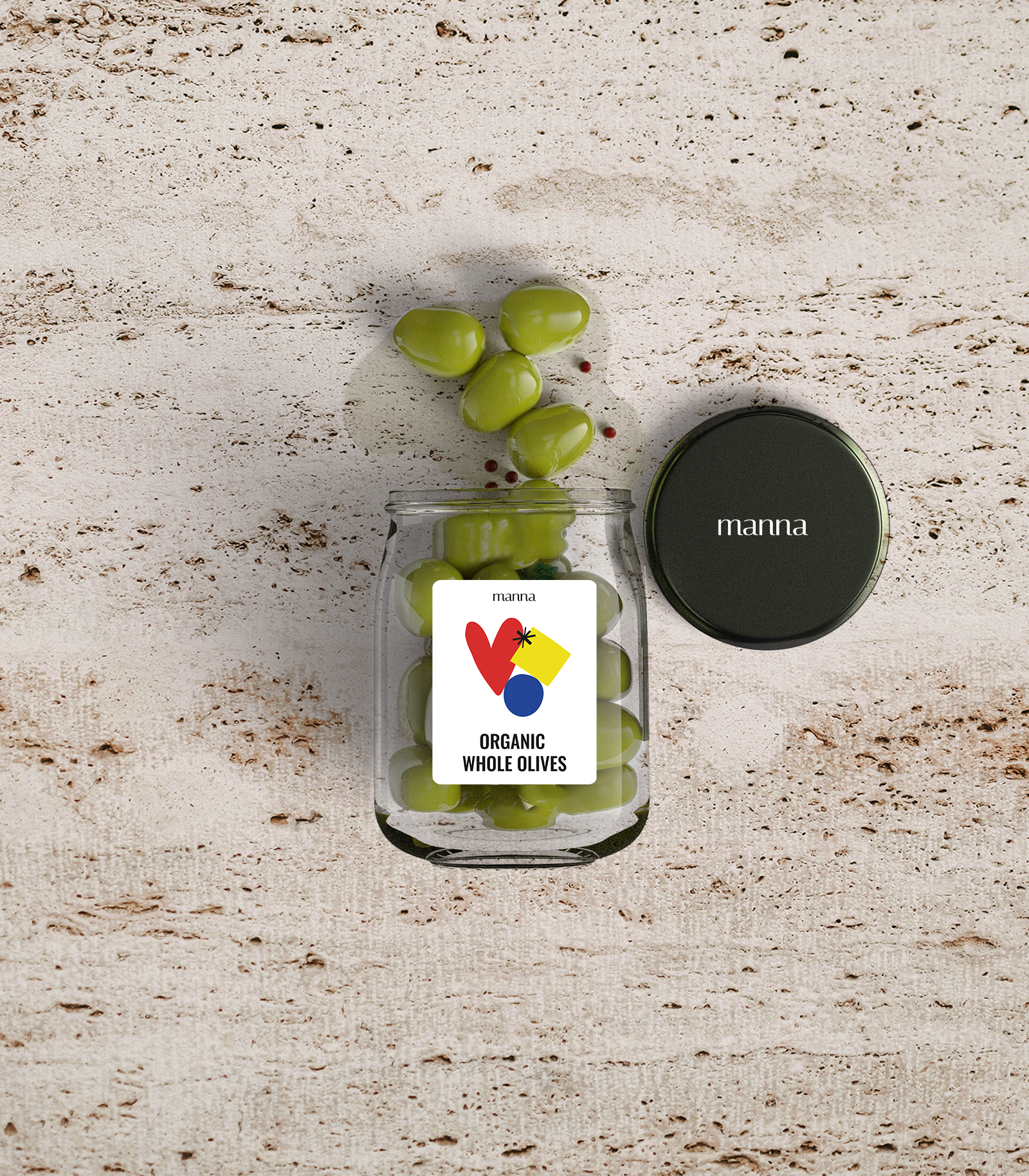
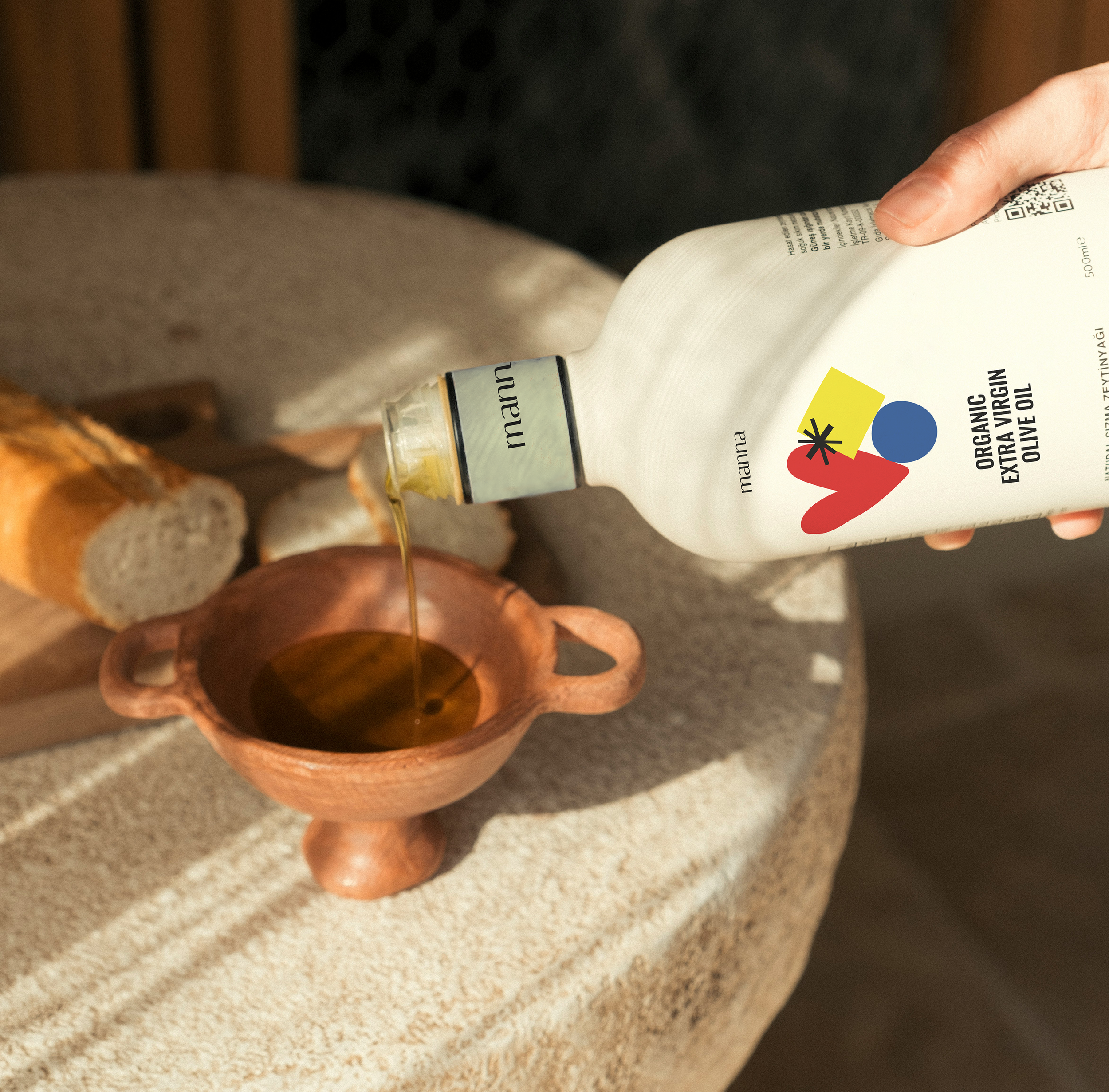
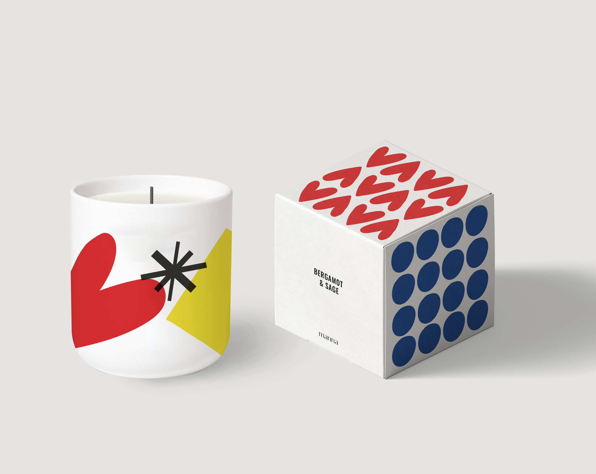
A Bold and expressive graphic language

Red has long been associated with passion and love.
Blue is calming and also represents
loyalty and compassion
Yellow is often associated with wisdom and spontaneity


This brand identity stands as Manna’s testimony to simplicity and audacity.
While the logo embraces a traditional aesthetic, the vibrant colors and bold typography convey their aspiration for a brighter, better future.
The clean shapes and primary colors reflect their authentic and honest personality, serving as a constant visual reminder of Manna’s purpose and core values.

Manna from love
Manna showcases its profound love, honesty, and kindness for the farm by honoring and celebrating its exceptional resources. By donating a portion of its benefits to local and global charities, Manna creates an everlasting circle of life; a true manna from love.